Puzzle-a-day solver in Typescript
Posted by jimblackler on Dec 12, 2024
I saw this puzzle for sale visiting a local exhibition.
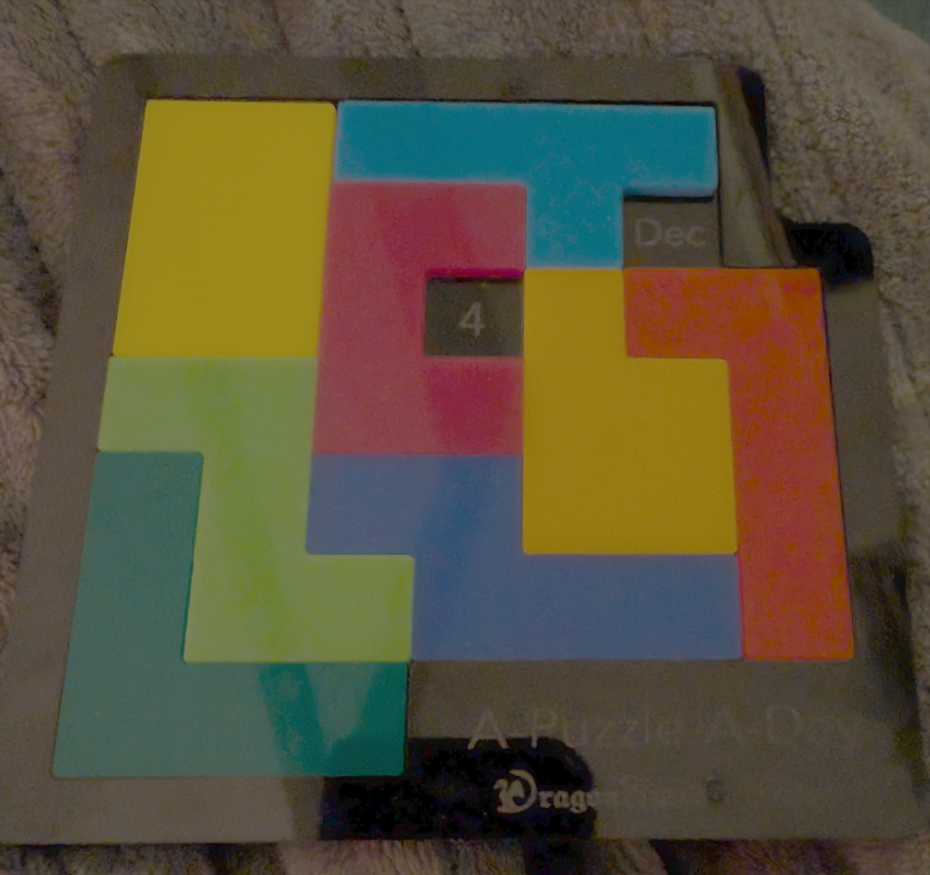
It’s a clever variation on the type of puzzle where you have to slot pieces of various shapes together to occupy an empty grid. This one has all the month names and the numbers 1 to 31 marked onto the game grid. The aim is to place the pieces to cover every grid square apart from the ones that indicate a selected date. That way there’s a fresh challenge for every day of the year.
I wondered how the designers of this clever puzzle had made sure that it was indeed possible to solve the puzzle for every day of the year. I guessed that a computer had been used to check this fact, and wondered how such a checker would be written.
So, for fun, I completed this task myself. I’ve made a solver written in TypeScript to run on a node.js compatible platform, such as Google App Engine.
Here’s how I wrote the program, and what I found.
I typed in the grid layout, and the puzzle piece layout, as two-dimensional arrays of ones and zeroes.
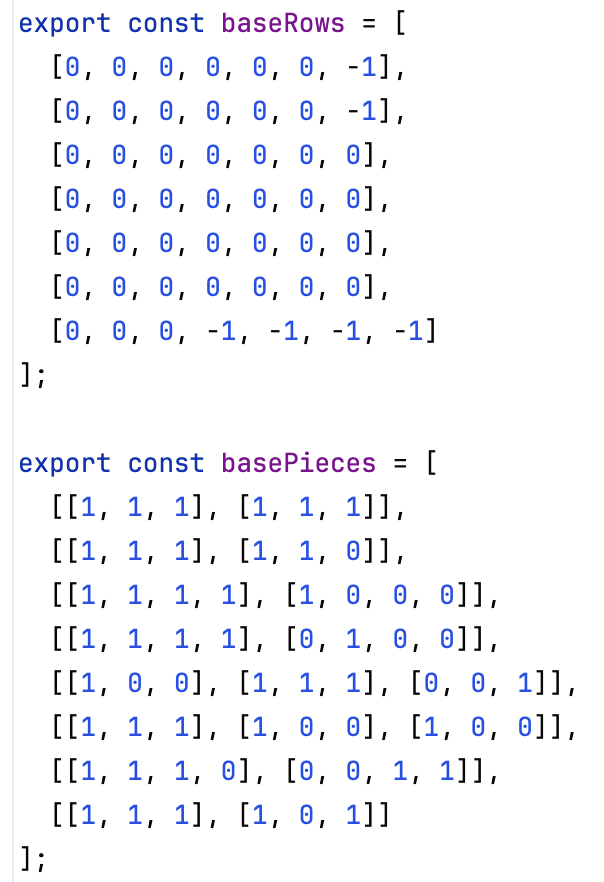
The program begins by marking out the grid to find solutions for the chosen date; blocking out the date squares that will need to be left uncovered.
To account for the fact that each piece can be rotated into one of four positions, and also flipped into another four, the program begins by calculating all the unique forms each shape can take.
Then the puzzle solving begins. The algorithm simply attempts to place every shape (in one of its valid rotation/flip variations) until the grid is full. Each step involves identifying the first empty cell when cells are ordered top-to-bottom, then left-to-right. Then, considering each variation of each unplaced piece in turn, it sees if it can be slotted with the first cell of the piece (ordered top to bottom, left to right) occupying that slot. If it can, it uses recursion to begin a new search considering the grid, and remaining pieces, as they are now. Whenever no pieces remain, the board state is added to the list of known valid solutions.
It could be described as a brute-force search, but as the grid is fairly small, it completes quickly enough to be practical.
I added a simple grid visualizer to show each solution, and selectors to allow the solutions of any date to be shown.
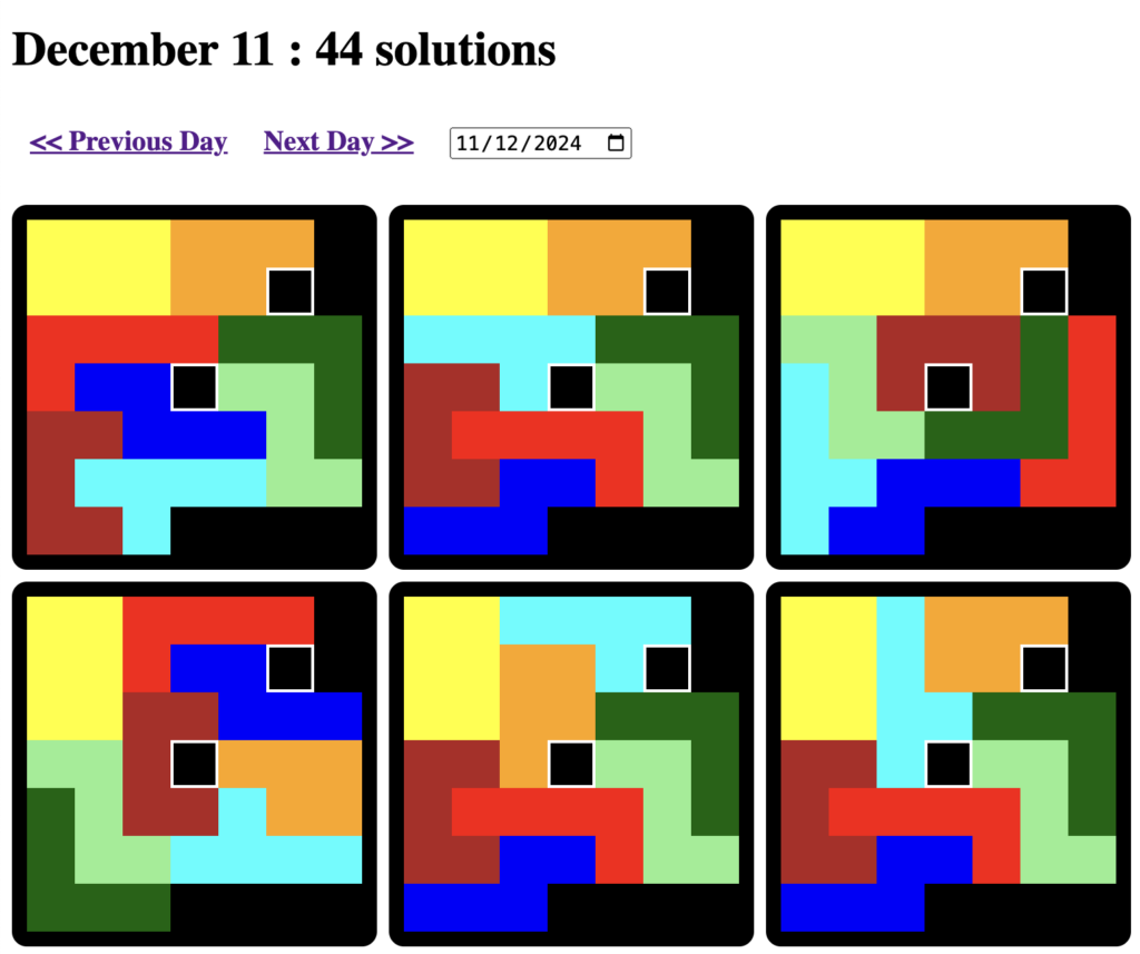
One thing that surprised me was how many solutions existed. It’s typical for the solver to find 100+ different solutions for any date. November 5th has 178 solutions. Although some, like October 6th, have just seven solutions. Nonetheless it made me think that computer verification might not have been needed. An experienced puzzler could find at least a single solution for each date.
You can find the program online at https://solve-annual.appspot.com/ and the source, licensed as free software, is on GitHub at https://github.com/jimblackler/solve-annual.
NPM (node.js library) version of my tree diagram generator, and a new interactive demo site
Posted by jimblackler on Jan 8, 2023
In 2014 I published a tree diagram generation tool (link). I’ve had a modest amount of positive feedback over the years so I decided to update it to use modern JavaScript (ES6) plus TypeScript and package it as an NPM project. It’s amazing how much the web world has moved on in the last eight years, and giving something a polish can be surprisingly satisfying.
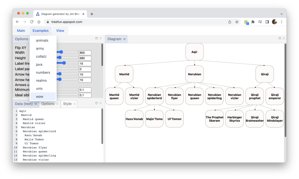
The differences were so significant that I felt a new GitHub repo was appropriate. It’s here.
I’ve also developed a new online version of the tree generator that can act as a diagram generator, demo and playground for the tool. It has a new IDE-like design, thanks to the excellent GoldenLayout library. It’s here
Once again the tool is free software offered under an Apache 2.0 licence. As always, any questions can be reported as an issue on GitHub, or by emailing me at jimblackler@gmail.com.
Nonogram Pro; a puzzle game written in ES6+Typescript for node.js and the web
Posted by jimblackler on Nov 19, 2022
I’ve made a new project which is online in an App Engine instance at https://nonogrampro.appspot.com/
About
I’m a fan of Nonogram puzzles, also known as Picross and many other names. Nonogram puzzles were invented in 1987 by Non Ishida and independently by Tetsuya Nishio. Players have to complete a grid to discover which cells are shaded based on number clues in the rows and columns. The Wikipedia article on Nonograms is a good source of history of the puzzle type as well as information on how to play.
There are many Nonogram games that can be played online. However some may know that I made a website based Solitaire game which has become modestly popular over the years. https://jimblackler.com/blog/?p=303 People have said they appreciate the clean design with no advertisements or flashy effects that distract from the game. I thought maybe I could do the same for Nonogram puzzles.

Completing the project
First something of a confession; I actually started this project in 2017. I made a lot of progress, but I must have got distracted by something, so I left it unfinished. Sadly as many tinkerers like me have found it’s a lot easier to start something than it is to finish. This project was still in the back of my mind though, so I made the decision to pick it up again recently, and have successfully completed it. This just shows it’s never too late to resurrect an abandoned project.
I did update it to the latest tech though. It’s now written in Typescript, and I converted the old Python back end to one written in Node.js. This is the tech that I’m really enjoying working with these days. One advantage of using Node.js is that code can be easily shared between client and server and that can be useful for puzzle processing. This is handy for the ‘hint’ function I’ve supplied with the game; it uses the same solver that is used server-side to make sure that puzzles can be completed.
How it works
The client works by rendering the puzzle as an SVG created in script.I could have used Canvas, but using SVG handles the graphical updates efficiently and allows me to use CSS to style the puzzles.
Having written the game I needed some actual puzzle designs to use. I could probably have done some drawings but I’m not really that artistic and I wanted about 50 or so. I hit on the idea of creating puzzles using libraries of icon images that can be freely remixed; i.e. ones that have a Creative Commons or public domain licence. Even better if they were stored in a vector format like SVG; they could be then scaled to the Nonogram grid.
This approach worked surprisingly well. My importer can iterate through whole libraries and render the images in a very large grid. It then ‘trims’ off the vertical and horizontal edges that contain no content, then shrinks the leftover image to a pattern of shaded cells of the required grid size.
However you might be surprised to learn that more often than not importing an image like that would create a puzzle that either had more than one solution or that would require advanced solution techniques because they couldn’t be solved one row or column at a time. That’s no fun for the player, so the importer actually attempts to solve the puzzle first from the generated clues. If it’s not possible to complete it using the standard set of techniques the puzzle isn’t used. If it is possible to complete it, the number of rounds required to complete with the standard method becomes the ‘difficulty’ shown with the puzzle.

I then look at the generated puzzles and select the best ones to publish on the front page.
I tried to include a variety of grid sized puzzles, 5×5, 10×10, etc. up to 30 x 30. And the import worked so well that I smashed my target of 50 puzzles. There are over 600 in the collection.
Game and editor
The game uses the browser’s local storage to keep track of which puzzles you’ve completed.
I’ve even included an editor so you can design and publish your own Nonogram puzzles!
You can try them in your own browser, or publish them on the site. This creates a link for the puzzles that could be sent to other people so they can try them. To do that requires signing in with a Google account and selecting an author name for your puzzles.
If you have generated any puzzle you’re particularly pleased with, let me know by email and I’ll consider adding them to the selection of puzzles that everyone sees on the front page of the site.
As usual the code for my projects is on GitHub so that anyone can see how it works, and made available with an open source licence.
JSON to Google Sheets importer written in JavaScript and Java
Posted by jimblackler on Jun 13, 2021
I’ve written about how much I like JSON before. It’s a really convenient way to store and transmit data across many different applications.
I also like Google Sheets, but while you can import CSV data, it’s not easy to import JSON data. This is a shame because I use tools that output data in JSON that would be really convenient to view in Sheets.
I didn’t like any of the workarounds I could find on the web, so I wrote my own. To make it as easy as possible for users, it uses the JavaScript Google Sheets API which means that the whole app can run in a website easily, and my App Engine site doesn’t have to deal with any user data (Authentication is done on the server because the client side authentication isn’t working well with browsers that prohibit third party cookies.) The application is already online, hosted on App Engine at https://jsonworkspace.appspot.com/
The main requirement is that the data is formatted as a JSON array. Each element will be converted to a Google Sheets row, with the columns set from the dictionary keys found in object. For example, pasting the below code into the form..
[
  {
    "Title": "The Godfather",
    "Year": 1972,
    "Stars": ["Marlon Brando", "Al Pacino", "James Caan"]
  },
  {
    "Title": "Gone With the Wind",
    "Year": 1939,
    "Stars": ["Clark Gable", "Vivien Leigh"]
  },
    {
    "Title": "Jaws",
    "Year": 1975,
    "Stars": ["Roy Scheider", "Robert Shaw", "Richard Dreyfuss"]
  }
]
.. would result in the following Google Sheet being created for the user when the Import button was pressed.

You can see in the above example how an embedded array (”stars’) was converted into named sub-columns in a process I call flattening. A similar process is used on dictionaries. This means that a variety of JSON documents can be imported; the importer is always able to convert the data to a 2D collection of cells. The only limit is the Google Sheets limits on the number of rows and columns.
I hope people find it useful. Feel free to contact me at jimblackler@gmail.com with any queries or comments.
The source is offered under an Apache License 2.0 and is available at https://github.com/jimblackler/jsonworkspace
jsonschematypes: a Java code generator from JSON Schemas
Posted by jimblackler on Nov 7, 2020
I like to develop apps that work on different platforms, and across different platforms. These apps often need to transmit data across the network (e.g. in the case of a web application with both server and JavaScript code), store data in files, or read configuration data. I’m a fan of using JSON for these types of applications. It’s a popular meta-format based on JavaScript types and syntax, but its use extends well beyond JavaScript applications. There are many interchange formats, but JSON is very well supported; there are JSON libraries for every language you can think of. It’s stored as text, which means it is easily sent in web requests, and it’s easy for humans to read and edit (much friendlier than XML, or a binary format, in my opinion).
A JSON file to store or transmit a player details in a game might look like this:
{
    "name": "Jim",
    "score": 500,
    "alive": true
}
On thing that makes JSON easy to use is that you don’t need a formal definition of valid data. One system can write a JSON file and another can read it, without any other files needing to be shared. The convention as to how the JSON should be interpreted is a matter of convention; determined by how the programs are written.
That’s great for making a quick start when you’re creating software. But it can cause a problem as the program grows in complexity, or more engineers get involved. Without a formal written structure (known as a schema) it’s easy to become confused about exactly how to read or write it.
JSON Schema
Fortunately there is a standard schema format for JSON, called appropriately JSON Schema.
A JSON Schema is itself a JSON document that specifies a test as to whether another JSON file passes certain tests that assert its validity for a certain application. An application developer supplies a schema for their program’s data, and if an individual file passes the schema, it’s valid for use.
This is one schema to validate the above JSON:
{
  "$schema": "https://json-schema.org/draft/2019-09/schema",
  "properties": {
    "name": {
      "type": "string"
    },
    "score": {
      "type": "integer",
      "minimum": 0
    },
    "alive": {
      "type": "boolean"
    }
  },
  "additionalProperties": false,
  "required": ["name", "score"]
}
I’ve been working on an application that uses JSON extensively. Much of the system is written in Java, so I use the popular org.json library to read the data. The text of a JSON file is parsed into an org.json.JSONObject or JSONArray, then it’s read using string key accessors. For example:
  public static void read(JSONObject jsonObject) {
    String name = jsonObject.getString("name");
    int score = jsonObject.getInt("score");
    boolean alive = jsonObject.getBoolean("alive");
    // ....
  }
Having to use string key accessors means that there’s room for programming error; even when a Schema is available. I found a few libraries that could copy JSON data into structured Java classes. However they all required the whole JSON file to be copied into Java classes at once. This means that if schemas aren’t available or practical for part of the data, they can’t be used. If the schema uses features that the library doesn’t support, it can’t be used either.
I wanted something that could allow me to gradually adapt a program written for org.json types into structured types, with the option to ‘fall back’ to regular unstructured data access for any reason.
Structured JSON access in Java
Something like this:
  public static void read(JSONObject jsonObject) {
    Player player = new Player(jsonObject);
    String name = player.getName();
    int score = player.getScore();
    boolean alive = player.isAlive();
    // ...
  }
This approach greatly reduces the changes of misinterpreting the structure. IDEs such as those published by JetBrains will be able to make suggestions as you type that match the intended format of the data you’re reading. In short; errors that would normally become evident at run time are made evident as you first write the code.
jsonschematypes
I wrote a library to generate Java wrappers around org.json objects that make this kind of structured access possible. It means that many format problems will be detected at build time, rather than run time.
It converts standard JSON Schemas into strutured access classes that wrap the JSONObject. They look like this:
public class Player {
	private final JSONObject jsonObject;

	public Player(JSONObject jsonObject) {
		this.jsonObject = jsonObject;
	}

	public JSONObject getJSONObject() {
		return jsonObject;
	}

	public String getName() {
		return jsonObject.getString("name");
	}

	public int getScore() {
		return jsonObject.getInt("score");
	}

	public boolean isAlive() {
		return jsonObject.getBoolean("alive");
	}

	public boolean hasAlive() {
		return jsonObject.has("alive");
	}
}
Design
Classes are created according to the design of the JSON Schema from which they are derived. The library takes some license in creating Java classes that match the inferred intent of the schema, to make them relatively lightweight and not overwhelming humans to read. This means tactcialy omitting some varations of accessors that could potentially be supplied. For example, if a schema specifies a default value for a property, no has method will be generated to test for the presence of that property on an object, since a value can always be returned. The effect of this is that changes to the schema could result in methods being removecd from generated Java classes.
Where the generator cannot identify any useful accessors to build, no class is generated and the containing class will supply JSONObjects directly.
The generated classes are designed to be as close as possible to idiomatic Java as possible. For example, using is getters such as isEnabled when exposing booleans.
They are not designed to hide or completely abstract the fact that the objects they interface are backed by JSONObjects and JSONArrays. It is a goal of the library that programmers can switched to unstructured access (via the usual JSON accessors) of data where required.
To build the classes I used a code generation library com.helger.jcodemodel which is an extended fork of Sun’s Java code generator.
As well as the Java library there’s a Gradle plugin that means it can be use in IntellIJ IDEA and Android Studio to automatically generate the classes when your schema changes.
Library, plugin and demonstration
Instructions on how to use it are on the github repository, where I’ve made the source code available under the Apache 2.0 license. Note there are separate instructions for the library and for the Gradle plugin.
There’s also an online demonstration where you can copy your own schemas into an editor and preview the Java code that would be created.
If you have questions, as always, feel free to contact me on the comments below, in GitHub issues on the project, or by email at jimblackler@gmail.com.
Visualizing how fractions are written as decimal digits
Posted by jimblackler on Jul 5, 2015
For a demo click here
I’ve written a web app that generates diagrams showing the sequence of digits when a fraction (such as ¼) is written in decimal form (0.25). One diagram can be used for every fraction (non-negative proper fraction) with a particular value on the bottom (the denominator). My program feeds data into the springy.js framework which uses a force-based layout to draws network diagrams of graphs.
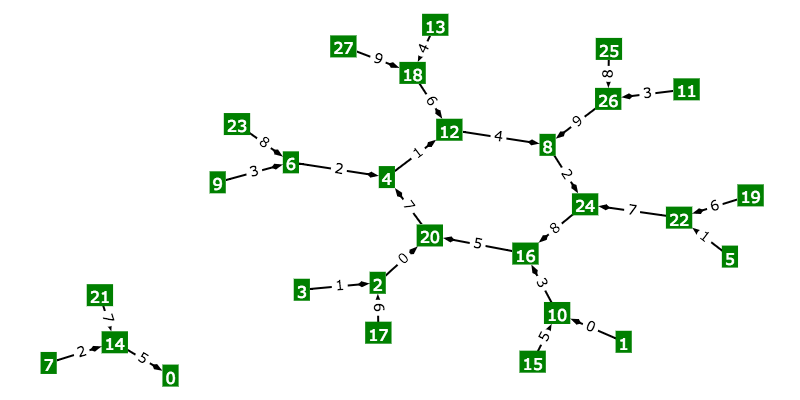
To see how to find the decimal form of 21 / 56, click on the demo link. This diagram can be used to find the decimal form any non-negative proper fraction with 56 on the bottom.
Start by writing down “0.” (since all simple fractions are no less than zero but under one). Then find the vertex labeled ‘21’, your numerator (the top part of the fraction). Next simply follow the arrows, writing down the numbers on the arrows as you go. The arrow labeled “3” takes you to vertex 42 (write down “3”), “7” to vertex 28 (write down “7”), and “5” to vertex 0 (write down “5”). We always stop at ‘0’ so the sequence is complete.
You’ve written “0.”, “3”, “7”, “5”. A quick check on a calculator will confirm that 21 / 56 is equal to 0.375.
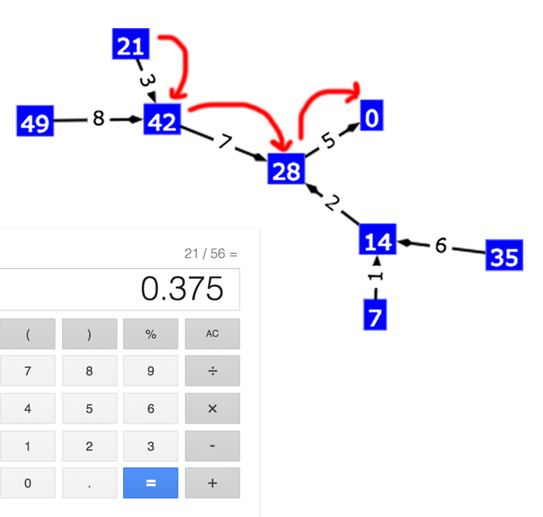
This diagram works for all other fractions with a denominator of 56 and numerator between zero and 55. On the same diagram try for ‘18’. The sequence starts out “3”, “2” but after a bit you’ll find you’re in a cycle that starts “1”, “4”, “2”, “8”, “5”, “7”, then returns to “1”.
Checking with a calculator shows me that 18 / 56 is 0.32142857142857142857… repeating forever.
Motivation
I made the app because I was wondering if there was a rule to say which fractions had repeating sequences when written as decimals, and it occurred to me how easy it would be to generate a graph from the data using a standard tool. I’m still thinking about the rule problem, but the diagrams help visualize the problem.
More diagrams
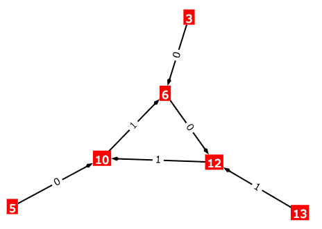
Here are some more examples for fractions of different denominator values.
Note that you can change the values in the input boxes then hit return. You can also use the up/down arrow boxes when an input box is enabled.
Springy is like most popular graph diagram generators in that it uses a spring system to arrange the vertices.
This makes it interesting and fun to.manipulate. However you usually need to ‘unknot’ diagrams by hand to remove any overlapping edges. A graph drawing algorithm could be tailored to generate these diagrams while maintaining more of the symmetry and making overlapping edges impossible.
How it works
Pseudocode to generate the diagram:
for (numerator = 0; numerator != denominator; n++) {
  // make a vertex labeled ‘numerator’
}

for (numerator = 0; numerator != denominator; n++) {
  digit = (numerator * 10) / denominator;
  next = (numerator * 10) % denominator;
  // make an edge from ‘numerator’ vertex to ‘next’
  // vertex, labeled ‘digit’
}
To understand how this works, consider how you might find just the first digit after the decimal point in an expansion of a fraction n / d (non-negative proper fraction). Remember that in general, multiplying a number by 10 shifts its decimal point one position to the right. If we do that to any fraction we get 10n / d. Now what was the first digit of its decimal form (right of the decimal point) is now to the left of the decimal point. So the whole part (the ‘quotient’) of 10n divided by d will give us the first decimal digit. The remainder of 10n divided by d (still over d) represents the part to the right of the decimal point, which is the rest of the decimal string (discarding the leading ‘0.’). Since ‘n’ hasn’t changed we can find this value on the same diagram, and repeat the process to get the next digit, then continue forever to get the whole string!
Let’s look at an example 25/27. Your calculator will show you this is 0.9259259259259259. But let’s verify with this method.
25 multiplied by 10 is 250, which divided by 27 is equal to 9 + 7 / 27. “9” is the whole part (the quotient) and this is the first digit. 7 / 27 is the remainder which is the rest of the string. Indeed, my calculator tells me this is 0.25925925925925924. If I repeat the process for 7 / 27, I get 70 / 27 which is 2 + 16 / 27. “2” is the next digit. Repeat with the remainder, so 16 / 27 goes to 160 / 27 which is 5 + 25 / 27. The next digit is “5”, but now our remainder is what we started with. So we will repeat “9”, “2”, “5”, forever, verifying the calculator result of 0.925925925….
Different bases
What if we wanted to see how fractions would be written in systems other than decimal, such as binary or hexadecimal? Changing the base is as easy as changing the number 10 in our calculations above. This diagram shows part of a binary base expansion.
Some more examples:
Patterns
We get lots of interesting patterns from playing with the numbers, but whatever you do, certain constraints arise. Many of thse are from the fact that the kind of graph we create is a directed pseudoforest, that is, every vertex has exactly one edge out (although this may be to itself).
Given the ‘many to one’ relationship between the different vertices (each vertex has just one edge out) you can only ever end up with one or more subgraphs of connected vertices formed of a ‘hub’ (one or more vertices in a cycle) and ‘spokes’ (non cycling or tree graphs heading into the hub).
The rough explanation is that a walk starting at any vertex you will always end in a cycle or (closed walk) since even ‘0’ has an edge back to itself. Any other vertex with a walk reaches any vertex on this cycle will be part of the same subgraph (connectable in any direction on the edges). Since any walk can only have one cycle, no other cycles can exist in this subtree. So, all walks entering the cycle can be drawn as trees rooted at the position they enter the cycle.
But beyond that in this specific case (the fraction graphs) you see some really interesting patterns just by changing the numbers.
Note how values of ‘d’ that have no factors in common with the base (in the case of 10 can’t be evenly divided by 2, 5 or 10) have subgraphs that are all cycles.
You might consider how d’s prime factors (including if they are in common with the base’s prime factors or not) affect the shape of the graph. You might ask what determines the number of subgraphs, or the number of vertices in the cycles, and whether they are all the same.
Another interesting thing about this is the whole graph is a closed walk (starting at any value will end up in the original position) you now have a graph equivalent to the kind encountered in the modular arithmetic used in cryptography.
Source
I hope you enjoy the app. The source can be found on GitHub.
Your Photos Watch, an app for Android Wear
Posted by jimblackler on Jan 6, 2015
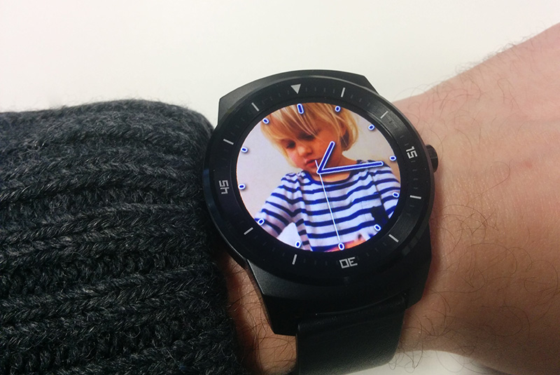
I’ve just published a new app for Android Wear smartwatches to the Google Play Store. It’s called Your Photos Watch and it lets you view your personal photos as backgrounds to a specially-designed watch face.
Project
I wrote previously about my first Android Wear watch face. With that project done I turned to something a little more complex. When I first received my smartwatch (a LG G Watch), I thought it might be nice to put some family photos on it – like a high-tech version of the photo in the wallet. I was a little disappointed to find that this isn’t something supported out-of-the-box. Nor could I find any photo apps on the Play store, using the obvious keywords.
This seemed like a missed opportunity as this is something that a smartwatch can uniquely offer. As an app developer there was only one thing to do; make the app myself.
Making the app you want to see is an approach I would recommend to anyone looking to get started with app development. Think of those times you go looking for an app to do a particular thing and don’t find one that works the way you want. Build that app and get it out there! Others will find it useful too, I guarantee it!
App design
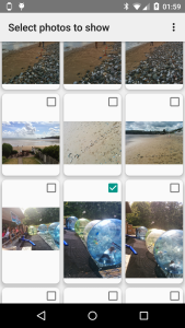
I asked myself what form the app should take. A simple picture viewer was one idea, but traditional apps aren't really a good fit for the tiny screen of smartwatch. A custom watch face seemed like a better approach. The app could show a fresh picture each time the watch wakes from ambient mode (done by the watch when you rotate it to look at it). The user could make a selection photos to show using the companion phone app.
Data
The first technical hurdles were to get the photos from the phone app to the watch face app, and to keep them stored there.
In my first experiments I attempted to download photos directly from the internet on the device. I soon found out that this isn’t supported – directly at least – even though it could have been, since the watch is effectively tethered to the phone, which could proxy an internet connection. I realized this was probably by design, to encourage a thoughtful economy of internet use. I studied the intention of the Android Wear design to see how my plans could be adapted to gel with the API designers’ intentions.
I studied the Data API and after some experiments it was clear that creating a Data Item per photograph would allow me to synchronize from phone to watch. In addition experiments showed that the Data Items persist as long as the companion app remains installed on the phone. This means that in practice the Data API can act as long-term storage for the photos. The watch face and companion apps simply query for all Data Items to see which photographs have been selected by the user. When the user chooses to remove a picture, the Data Item is deleted.
Cropping

One issue had yet to be solved. I was expecting to have to down-scale pictures to the resolution of the watch. However, the screen resolution of the smart watches is in a square aspect where most photographs are something like 4:3. It would not be possible to show the whole picture on the full screen of the watch. Some ‘letterboxing’ could be applied to show the entire picture but on an already small watch face this means diminished visual impact. I’d rather crop the photos, but this means typically one quarter of the area of the picture will have to be cut out.
Unfortunately taking the center square of the photo will often crop out the subject of the photo. A common case is when the subject is standing, in a vertical or ‘portrait’ format picture. The face is often in the top quarter of the frame; not the center, as in the picture above.

Here’s an example of a landscape format photograph where the subject of the photograph (some strange looking software engineer) is not in the center of the frame. If this photo was cropped for a watch face by taking the center square, half of the subject’s face would be cut from the picture, which in this would be terrible.

The most obvious option would be to have the user select the area to crop in the companion app. However this adds an extra step for users to complete. On mobile, fewer required user interactions is always better.
Face detection
My more ambitious idea was to use some off-the-shelf computer image recognition software to find the faces in each picture. When faces were found the cropped square can be adjusted to ensure as many as possible were in the chosen area.


It says something about technology today when such a computationally-intensive task can be performed on demand on a mobile phone, but a quick web search revealed that this was indeed feasible. The free software application called Open CV emerged as the most likely candidate. An Android port is available and many developers seem to be using it.
[Later edit: Thanks to Ian Lake on the Google+ Android Wear Developers group for pointing me at this article. The existence of this class escaped me in my own research, somewhat embarrassingly. Since the OpenCV solution is working to my satisfaction currently I will leave it as it is for now.]
I had one or two practical issues importing the latest version into the build and getting the face-finding classifiers I had loaded and working. (Check the AutoCropper class in the files in the project on GitHub if you’re curious). Some tweaking of the input parameters was needed to get the balance between false negatives (faces not recognized) and processing time right.
I was pleased to arrive at a solution that works to my satisfaction around 19 times out of 20. The great advantage is the user has to do nothing to have their photos correctly cropped. In fact I would wager that the majority of users never even think about the cropping process. It will work as expected with no involvement from. Exactly how a good app should be.
Visual design
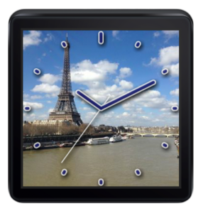
Making this app I spent a great deal of time tweaking the watch face design. I thought about exposing settings to the user to change the visual appearance. If enough people ask me I might add this in later versions, but design-wise this can be something of a cop out. I would prefer to ship the app with a design that made a strong statement and that I felt worked within the design constraints of the app.
The main problem is this; the watch face should communicate the time quickly and clearly. If it doesn’t, it is failing in its primary function as a watch face, and once the novelty of the photo feature is worn off people will switch to a more easily-read watch.
On the other hand, the design should not cover too much of the user’s photo. If it does, the unique selling proposition of the app is lost.
Yet these two requirements conflict. A bolder design will be easier to read but will obscure too much of the user’s photos.
Faces
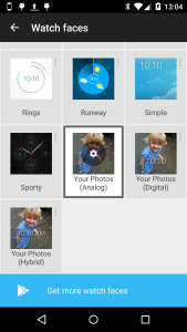
I decided to include both a digital and traditional “analog” watch face.
The analog face took by far the most experimentation. The first problem is choice of colors. These shouldn't be too similar to the background photograph color or the watch face will be unreadable. As I can’t predict the colors of the photographs selected by users this is a problem.
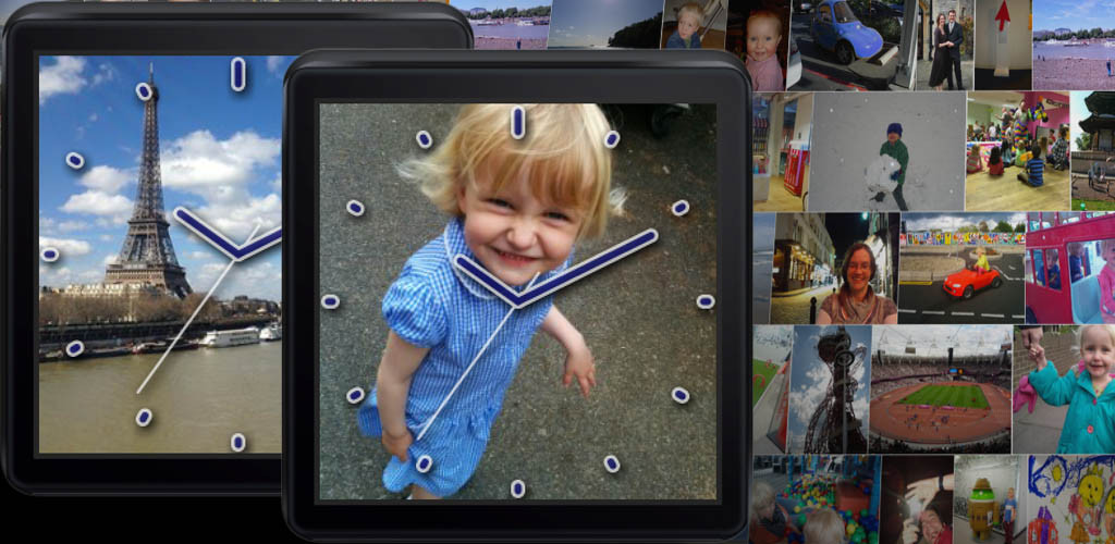
A trick for showing text of other details over a multi-colored background is to use two colors side-by-side that contrast from each other. That way you have created an internal contrast in the image, meaning it should be readable whatever the background is. In the case of the watch face I found a white outline a few pixels thick coupled with a dark blue fill color achieves this contrast. Because the effect is quite striking I softened the design with round rather than square edges on ticks and hands. The high contrast allows the hands to be drawn slightly semi-transparent (around the 80% opaque mark) to subtly reveal a small amount of extra detail under the hands and tick marks.

The application of a dark drop shadow creates even more contrast and creates a subtle three-dimensional effect with the watch face over the background picture.
The digital face was a lot more straightforward. I chose to display hours and minutes in a large-ish Roboto font in the bottom half of the screen. Because it occupies relatively little of the screen the risk of obscuring the user photos is low. The same contrast-enhancing methods were used in the analog face.
Data sources
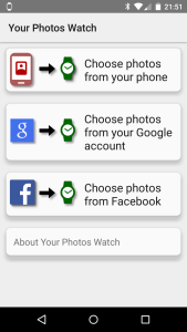 As the user has to supply photos for the watch face, I needed to work out where these would come from. The most obvious and easiest source is the photos that the user has already stored on their phone (e.g. ones they have taken with their phone camera).
Phone
A query of images in the Media Store handles this easily, once the relevant permission is added to the manifest.
Two classes handle the import of photos and handling in a Recycler Adapter. (This project marked the first time I've used the new Recycler View on an Android project.)
One nice feature of this API is that the pictures can be requested in a couple of thumbnail sizes. The MINI_KIND size approximates at 512 x 384, which is actually larger than the typical target watch size of 320 x 320. That way my app doesn't have to downscale massive camera images itself.
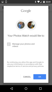
Given that any user with access to the play store will have their phone connected to a Google account, this suggested another obvious photo source. Interestingly there is no modern API to access photos shared on Google Plus, or photos that might have been save with the photos backup feature from one of the user’s previous Android phones. However these photos can be obtained from the aging Picasa API. I say aging, because this uses an earlier version of the GData API and by default returns XML.
This part of the operation turned out to be the trickiest parts of the project, something I had not anticipated at all.
I made several wrong turns trying to parse the XML, for instance by reading a document and using XPath expressions. After a lot of annoyances with namespaces in the XML, I got it working, just. However long delays in the app showed that this is simply far too slow to be done on the phone when 100s of photos are being processed.
Then I tried to use the official GData API Android libraries. However this took my app over the 65,535 symbol limit (Dex limit). I experimented with various ways to work around this such as ProGuard rules to strip unused content, and multi-Dex mode. However ProGuard was breaking OpenCV by stripping symbols it was using (the large amount of native code in OpenCV complicated this). I spent many hours trying to get the ProGuard rules right before deciding I should move on. Multi-dex mode was similarly troublesome.
I then went back to parsing the XML myself, this time using a faster “forward parser” (aka SAX) which interprets the XML stream without building a full version of the document in mmeory (a 'DOM'). This approach is faster but the code is considerably harder to develop and read than XPaths. This probably would have worked but I stubbornly wanted to separate the code that handled the parsing of each photo fragment into a different class, to match the existing structure of the code. Unfortunately, Java’s SAX implementation has a ‘push’ structure – the parser controls flow and calls back a handler with information about the file data – rather than a ‘pull’ structure where the main program would call back the parser to iterate over the data. This means the whole file has to be dealt with by a single handler. I looked around for an XML parser with a ‘pull’ approach but again I felt that I was really wasting time.
Then the penny dropped; I vaguely recalled that older Google feeds can on demand return a form of XML translated into JSON. JSON has a wider selection of parsers on Android including a ‘pull’ parser; android.util.JsonReader. Sure enough, adding ‘alt=json’ to the feed URL returned a translated feed. I could have the best of both worlds; my code could be structured the way I wanted, and a reasonable performance could be obtained too.
Authentication to get access to a user's private data was the remaining challenge. For Google GData services it is possible to authenticate with the aid of the phone's account manager. There is something of a back-and-forth (sometimes called the 'OAuth2 dance') to get the user's email address (required) and an up-to-date access token to pass in to the API.

I could have gone on to add access to lots of other services such as Dropbox, Flikr, Instagram and more. If this app gets super-popular and I get requests to do so, I might. However, there was one obvious candidate given its popularity on Android and its history as a photo-sharing service, and that’s Facebook. By allowing import of photos shared in Facebook I could increase further users chances of finding treasured photos for the watch service (and get some useful experience in the API for myself too!)
The last time I dealt with Facebook as a developer was at work, some time around 2009, when I added some integration widgets to the AdSense publisher controls. I remember this being reasonably straightforward, but even so taking a new look five years later I was amazed; Facebook’s developer experience is incredibly slick, for Android at least. They supply an Android library that integrates with the Facebook Android app making user management (signing in and out), authentication and data collection incredibly easy. I had it running quite quickly; the most complex part was some logic to select the most appropriate-sized version of images from the selection offered.
Another hurdle was that apps that request permission to view user photos need to be manually reviewed by Facebook to ensure they meet the terms of use and offer a good user experience. This was understandable but added a little paperwork and worry (for one thing, would the reviewers even have an Android Wear device to hand to test the app?) In the event, they quickly approved my request.
The app
Like all my apps it’s completely free. It’s on the Play Store from today. This one is licensed under Apache 2, and the source can be found on GitHub.
Feel free to get in touch on jimblackler@gmail.com if you have any thoughts or queries about the app.
Big Ben clock effect adapted for Android Wear
Posted by jimblackler on Dec 20, 2014
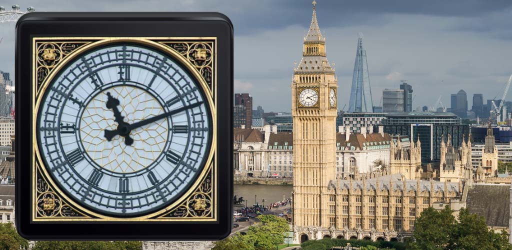
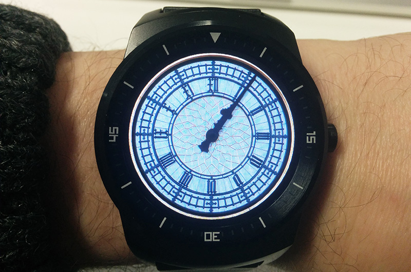
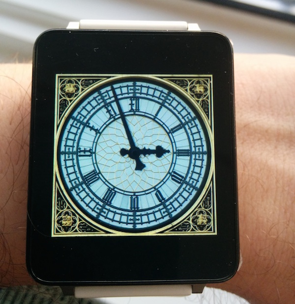
I made a watch face for Anrdoid Wear which is in the Play Store now. It’s inspired by the clock tower at the Palace of Westminster, London, better known as Big Ben.
Idea
Recently I was given an LG G Watch. As an introduction to Android Wear I loved it, I found the device much more useful than I was expecting. Not having to get my phone out of my pocket to check my notifications is surprisingly useful.
I also loved the ability to chose watch faces I’ve previously written about an animated Big Ben effect.This was written in SVG for use on the web, but I had a ‘light bulb moment’ when I realized that this existing could be adapted for Anrdoid Wear. Most of the difficult work (preparing the digital images and proving the concept would work) had been done.
Project
The first job was to update to Android Studio (I’ve been a long-standing Eclipse user to date) and to learn how to code for Android Wear. I was pleased to discover that it’s not too different to coding for a phone, it’s basically Android on the device, slightly cut down for the form factor. The hardest part for me was realizing how the two app executable (APKs) you have to deliver (one for phone, one for app) work together and how deployment (e.g. to Play Store) was supposed to be done.
Design
 I studied the design guidelines and realized one adjustment would need to be made; introduction of an ‘ambient mode’ where the screen was mostly black. This meant drawing new stylized versions of the watch face and hands, which I did in Inkscape. I tried to capture the iconic Gothic style of the original while using outline effects so as to draw very little content in ambient mode.
Code-wise it was then a matter of studying the watch face samples and producing my own version. I used Android canvas to scale, rotate and overlay the bitmap watch face elements.
Check it out
The app can be download from the Play Store now. It requires an Android Wear watch with Android 5 (Lollipop) or better.
Source for the project is available in GitHub.
A Reddit Bot written in Python, using the Reddit and YouTube APIs
Posted by jimblackler on Nov 30, 2014
I regularly read Reddit on a phone, and I’ve come to admire a particular bot autowikibot. When someone posts a link to a Wikipedia article the bot replies with an excerpt from the article directly into the conversation. Without the bot replying, in order to understand why the link was posted I’d have to follow the link – taking me out of the app, incurring a delay and data use.
I noticed that there was a similar problem to be solved with YouTube links. Reddit users regularly post these but unlike Wikipedia links there’s nothing in the URL to indicate what the article might be about, just a string of digits such as “dQw4w9WgXcQ”. When I’m reading a conversation on Reddit and someone posts a YouTube link without explanation it’s frustrating; I have to leave the Reddit app to know why that post was made.
I built a bot in Python using the Reddit API (via the superb PRAW), the Google API for YouTube for video statistics, all hosted on the cloud application platform Heroku.
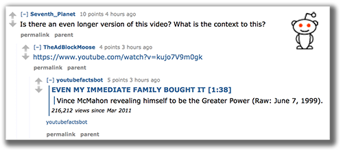
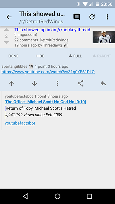
It’s up and running now, and can be seen in action at http://www.reddit.com/user/youtubefactsbot
What is Reddit and what are bots?
Redit is a massive and hugely popular discussion website. It has hundreds of millions of users, and thousands of subreddits (discussion pages). As well as internet users talking amongst themselves, the Reddit API allows the creation of ‘bots’. These can look like normal Reddit accounts, but their activity is controlled by an automated processes. The bots join in conversations; they typically react to a phrase and reply in order to provide information or amusement.
How does it work?
A bot is really nothing more than a manually-registered Reddit account being controlled through the API by a long-running program on a computer somewhere. Comments are fetched and and analysed by the program; if it chooses to reply, it does so through a POST to the API.
PRAW makes this process very easy with a helper method called comment_stream(). This allows you to get a look at submissions and comments as they are posted. Provided not much extra processing is needed, it’s feasible to keep up with the comment stream and react to every post.
My bot simply runs a regular expression over the comment to extract YouTube links, gets the video ID and fetches the data from the YouTube API. Most of the logic in the app is around formatting the comments and obeying Bot Etiquette.
Bot etiquette
From the outset with this project I wanted to ensure that the bot would be found useful and not annoying by Reddit users. It’s important to remember that a bot is a machine process injecting itself into a human conversation. This is one reason why bots have a mixed reputation on Reddit, even though subreddit moderators can choose to ban individual bots (very likely if they cause annoyance). I took care to err on the side of caution with the bot’s interaction.
At the time of writing, the bot:
-
Only replies to very short comments; normally just a raw link without context.
-
Doesn’t reply to a comment if there’s a reply already, so as not to break the flow of the conversation.
-
Attempts to delete any of its comments if they are downvoted (effectively allowing readers to delete bot comments).
-
Only adds a single comment to any given submission (thread); except in very large threads.
In addition, the creator of autowikibot made not only the source for his bot online, but also (via Reddit’s wiki feature) the user and subreddit blacklist. These are users who have requested the bot not reply to them, and subreddits that have banned the bot. By applying the same blacklists to the youtubefacts bot from day one I was able to reduce the risk that the bot would comment where it wasn’t wanted.
Mainly I took care to make the information posted by the bot about the videos as information-dense as possible in order to justify its position in the threads. I have a ton of information available from the API, but a lot of it (such as bit rate, comment count and more) simply would be interesting enough to justify it’s place in the thread. I decided not even to include the channel (YouTube poster) name. I include the video name, running time, view count and posting date. I also include the first line of the description as it often adds useful information about the context. I don’t do this if it contains a link so as not to potentially introduce spammy links into Reddit threads, and also because those kinds of comments tend to be promotional rather than informative.
Source
The source is also online at https://github.com/jimblackler/youtubefactsbot and licensed under GPL.
If you want your own implementation you’ll have to register applications on both Reddit and Google API (YouTube), sign into both accounts locally, and upload the secrets and tokens folder to your application on Heroku.
Hope you like the bot.
A colorful version of Conway’s Game of Life
Posted by jimblackler on Oct 30, 2014
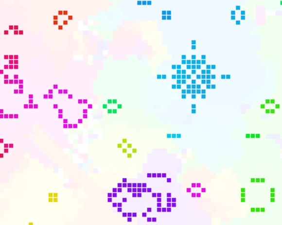
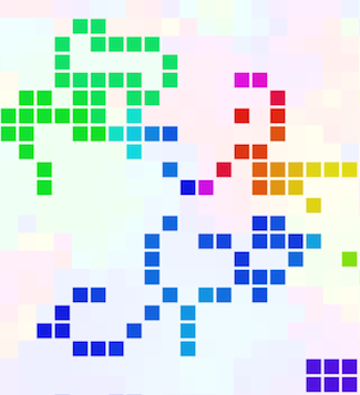 Here’s a web-based version of Conway’s Game of Life. The rules are the standard recipe but I’ve added colour a color effect to the cells. At startup the cells are assigned colors with random hues. Newly-created cells take the color most similar to the neighbouring cells. When cells die I leave a trace of their color in the vacant cell background.
Adding color makes the simulation more striking, and it also vividly illustrates how local patches of the simulation share common ancestry.
About Life
Conway’s Game of Life is a wonder of mathematics. Invented by mathematician John Conway in the 1970s, it isn’t really a game but a simulation experiment involving squares in a grid (‘cells’) that are either ‘live’ or ‘dead’. Any live cell without two or thee neighboring live cells (including diagonals) becomes a dead cell on the next turn (or ‘generation’). Any dead cell with three neighbouring live cells becomes live on the next generation.
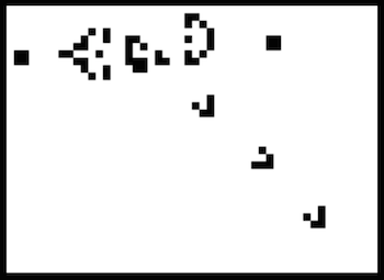
From those very simple rules arises a fascinating array of complex behavior. The menagerie of structures and creatures that can emerge has been studied continuously since Conway invented his game. You can read all about Oscillators, Spaceships, Reflectors and more on LifeWiki and elsewhere. The small library of Life shapes that I include in my simulation were borrowed from the excellent resources on LifeWiki.
Life is one of those ideas that is so simple it begs for variations. For my project I decided to make an implementation that kept the basic Life rules but added colors to the cells.
Demo
My demo is written in JavaScript and uses Canvas for the graphics. You can vary the size of the grid and the update rate with the links at the top of the page, as well as toggle the color effect.
When a cell is newly-created a hue is determined which is formed by summing a 2D vector for each of the three live neighbours’ hues; representing the position on the circumference of a circle where the angle represents the continuous hue value. The hue of the new cell is taken as the angle between the origin and the end of the combined vectors (using Math.atan2). This way an ‘average’ can be obtained that does not tend towards any locality on the color spectrum.
As the simulation is so computationally extensive it can act as a benchmark of sorts between browsers. At the time of writing, Safari on OS X was giving the fastest results.
The source is available on GitHub and has a GNU license.
As always, any comments or enquiries are welcome here or at jimblackler@gmail.com.
